App Redesigns for iPhone X
It took a little while but I finally re-designed my apps for iOS.
If there are any issues, please don't hesitate to send me a message!
What's new?
Not much. The apps themselves all pretty much function exactly as they did before, although a few bugs were fixed.
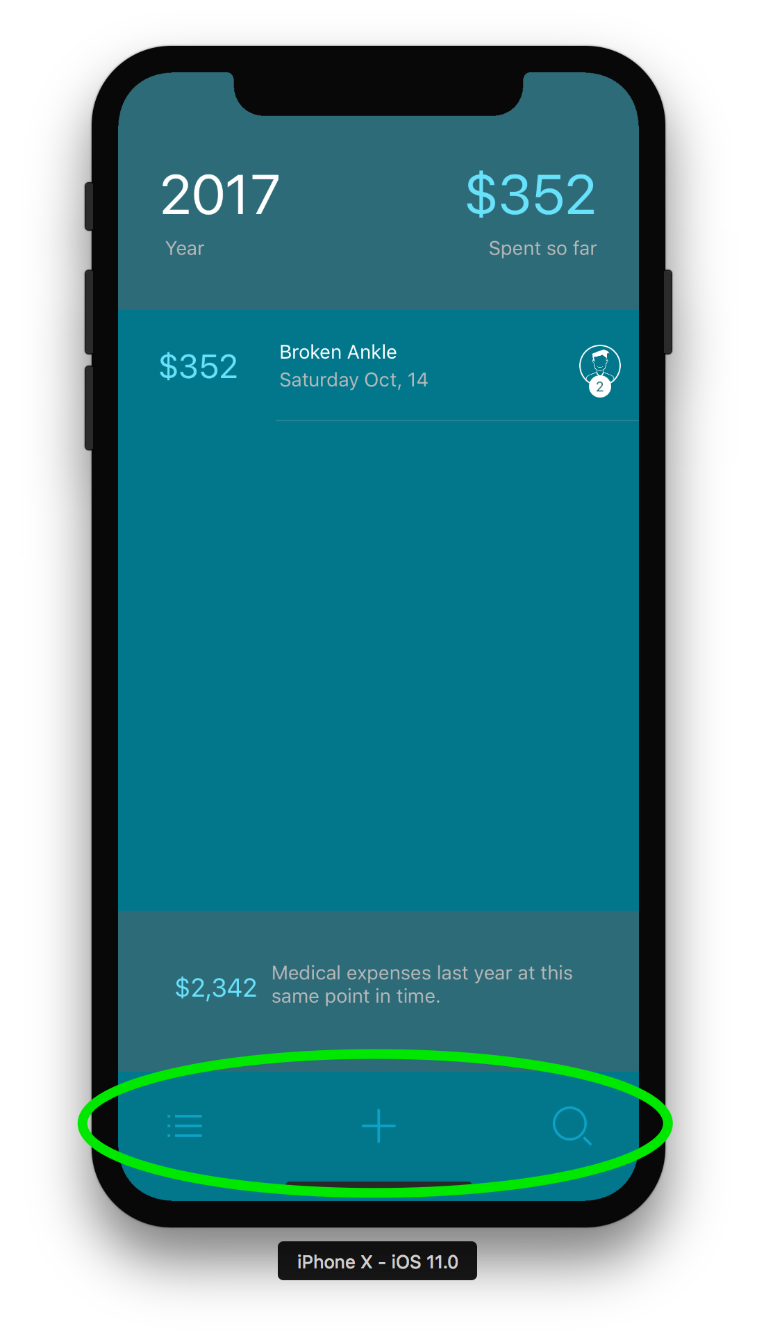
The main adjustments that I made revolve around changing every app to work with bottom navigation. Here's an example:
I feel like bottom navigation is the future of how apps will be developed. The comfort and ease of use for the new apps compared to the old ones is night and day. This is very easy to support as long as you handle the keyboard appropriately.
The keyboard often prevents you from moving your navigation items to the bottom.
The work around for handling the keyboard is:
- Whenever possible, make sure you can avoid the keyboard with popover items (aka, date pickers, number sliders, steppers, etc)
- If you absolutely can't avoid using the keyboard have a button launch a text entry interface.
Having a button launch a text editor will allow you to utilize bottom navigation on any view (my only exception was something like a search filter, where the user needs to enter text and filter down a list)
Having a button launch the text editor is a bit of an inconvenience but I think it's well worth it when you have a small number of fields and you can add the comfort of bottom navigation.


