Gift Hound
What problem am I trying to solve?
This is the usual "I want to do something but there's no free simple app that does it (without ads)" scenario.
I was hunting for a gift tracking app for Christmas so I downloaded a few free apps and many of them were pretty complex, where you had to fill in a bunch of info for each event you wish to track (I usually only need to track gifts a few times per year and I rarely need to track multiple events at once) plus you need to enter a budget and take a photo of the gift, etc. Almost every free app looked terrible or had ads or an in-app purchase for a required feature.
I figured I'd spend a week putting together something simple that I would enjoy using and throw it on the app store in case anyone else was interested.
How does my app solve this problem?
For simplicity sake, I only track one event at a time. Typical events like Christmas, Valentine's Day, Mother's Day and Father's Day are just built into the app. Depending on when you download the app you'll see whichever of these days is coming next.
Let's say you have your niece's birthday coming, just tap the days remaining at the top and change the current due date and the days remaining will update appropriately. No need to enter names, budgets, etc for the events or anything, just set the date and start tracking.
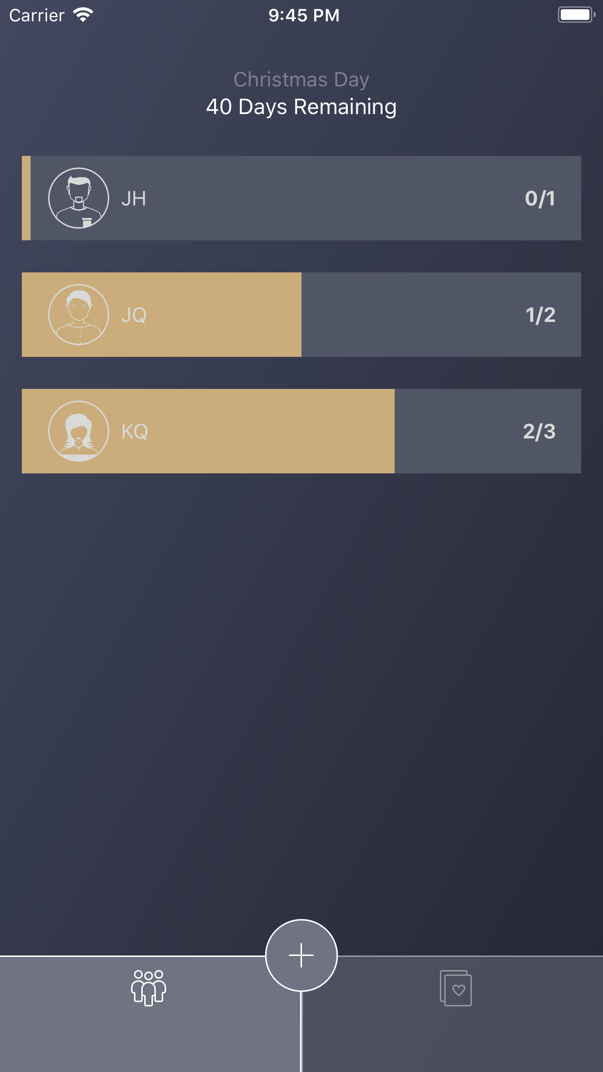
The two initial screens, list of gifts or list of recipients, can be toggled at the bottom, both have progress bars showing either the gift status or how many gifts you have left to buy for someone.
Gifts
Progress on how far along you are on each gift (from idea to wrapping)
People
Progress on how far along you are on buying all of their gifts
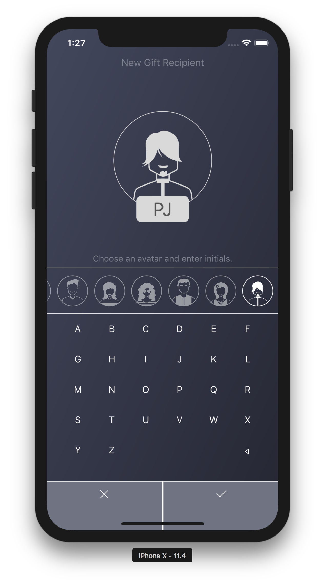
Now, I wanted recipient creation to be the easiest thing in the world so you basically tap an avatar and then enter 2 letters for their initials. A few things to note:
The keyboard is built into the view so it's not using the iOS keyboard. This is because the standard OS keyboard intrusive and ugly for simply entering 2 letters and it also requires me to validate stuff like non alpha chars, etc. This way everything is clean and fast.
If you follow my apps you should know by now that I usually build my apps specifically for one handed use. There's usually no actions appearing above the halfway point of the screen.
Person
Creating a person is as easy as selecting an avatar and typing 2 initials.
Creating a gift is the same way, just enter the gift name, tap one or more recipients and you're good to go. I added a gift note, but that's optional and it was only added because the screen was so empty and I needed to fill that real estate up with something.
I made sure there was no price field in the app, I think most users can figure out how much they're spending on people just by looking at their gift list. There's no need to start clutter up the app for something that provides little value.
New Gift
Creating or editing a gift requires on a few inputs, should be done in seconds.
One of the most important elements of the app is that each view is complete in the sense that you can do everything that you need with respect to what you are looking at. If you're creating a gift and didn't create a recipient, no problem, just create one in the gift interface. You don't need to exit, go back, create a recipient, then try to create a gift again. Same with deletion, you can swipe on any list to delete or tap to edit the item and delete it that way. It's very intuitive. There’s more than one way to perform all actions and the user should never have to backstep to accomplish something.
Summary
Some other things of note about my app are:
I'm using a weird tint system. Typically an app has one color to represent anything that's tappable. In my app it's sort of white, however, white is also used for most informational display. When in edit mode, I try to color something user entered yellow so it's different than labels and actions. I think it's a bit unorthodox but ends up being intuitive once you start using it.
I have a note to add more icons to the app, some for toddlers and babies and even cats or dogs, however, icons don't currently exist that match this design so I'll have to get some made.
Hopefully someone other than myself finds this app useful. As always, if you have any questions of comments feel free to leave me a note.


